Call Center Analysis
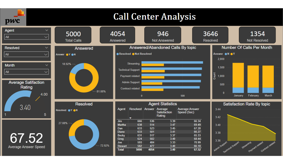
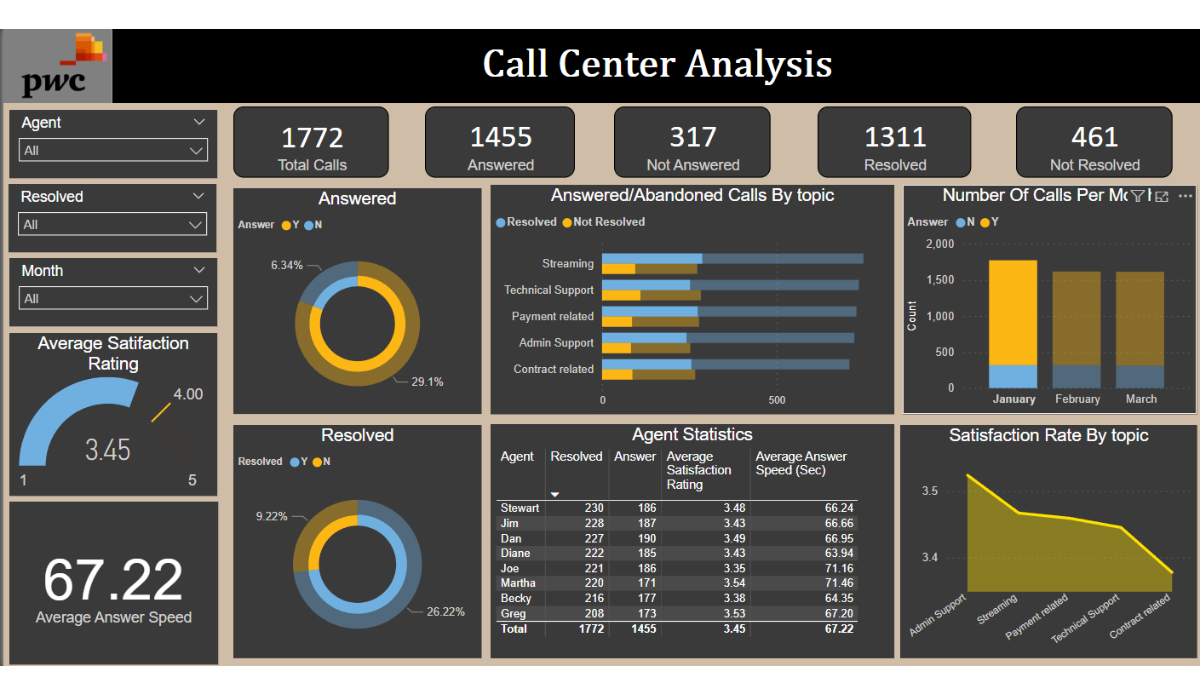
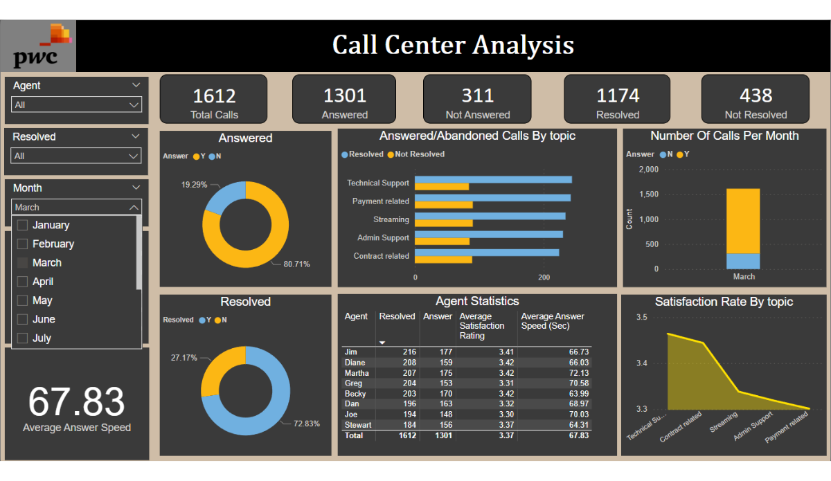
An interactive Power BI dashboard visualizing key call center metrics — peak hours, top performers, topic distribution, resolution rates, and speed-of-answer — so operations leads can prioritize training and optimize resource allocation.
Power BI
Python
SQL Server
Slicers · Visualization
Overview
This project translated raw call center operations data into an interactive dashboard that exposes the patterns leadership actually cares about — when the queue is worst, who handles calls well, and where resolution bottlenecks live. The result pairs fast visual scanning with drill-down slicers for root-cause questions.
Techniques
Slicers
Tables
Charts
Interactive Visualization
Key Findings
- Built an interactive dashboard visualizing key call center metrics; identified peak hours and top performers for strategic decision-making.
- Streamlined processes by analyzing topics, resolution rates, and speed of answer — insights prioritized training and optimized resource allocation.
- Championed data-driven decision making, linking call resolution to improved customer satisfaction.